
reminds me of some fauna combination in me garden
red shoes
Moderators: fgagnon, nikos, Site Mods

Re: red shoes
Looks like a refugee from Pokemon Go 
Re: red shoes
IMHO it is nothing so different from the actual one, the only change I see is that is more red (I know, did not have to study a bunch of books to get to that conclusion). 
The positive thing I see is that the yellow part would be more highlighted (as least in the taskbar since I use small icons). Now is difficult to barely see any difference.
Addendum: in the negative part, with those bright colors (in both cases), I'm starting to see flashy flowers and other effects with my eyes... wow! this is cheaper than weed!

Re: red shoes
Hi Nikos,
As far as I am concerned, it would be a welcome change. As things stand, the current ultimate icon uses the same orangey color as Google Chrome Canary. The overall shape is different, but the colors are so similar that they fool the eye.
Cheers,
Robert
As far as I am concerned, it would be a welcome change. As things stand, the current ultimate icon uses the same orangey color as Google Chrome Canary. The overall shape is different, but the colors are so similar that they fool the eye.
Cheers,
Robert
-
FrizzleFry

- Platinum Member

- Posts: 1241
- Joined: 2005 Oct 16, 19:09
Re: red shoes
I do no like this red or the orange icon much... they are just too bright I guess... but it does not really matter since I replace the built in icon with one colored like the x2 pro icon which was posted on the forum some time ago...
Re: red shoes
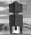
What about this one coming out from my own oven?
Re: red shoes
I stared at that icon for a long time trying to determine what the logo means, and finally I got it, it appears to be a squashed X, I don't see anything that depicts a 2 in the logo, The standard X2 icon clearly depicts a 2 in the logo, and the gold colours are nice, why not retain brand identity with the same X2 logo ?, just make the gold lusher, richer, so that it truly stands out against the icons background colour.
nikos, are you that bored ?,
nikos, are you that bored ?,
-
pschroeter
- Silver Member

- Posts: 283
- Joined: 2007 Jan 27, 00:46
Re: red shoes
As long as you don't use it in X2 Professional I don't care what you do with that gaudy thing.
Re: red shoes
Umm... perhaps you should stick to topographical analyses - your foray into two dimensions is doubtful.sanferno wrote:What about this one coming out from my own oven?
Having "Irish-ificated" my icon years ago, like FrizzleFry I just keep replacing it dutifully upon each update. Us fetishists have to stick together.
Re: red shoes
For me it is more like one main explorer pane (biggest square), and two tabs (the little rectangles). Though I also believe it is quite abstract.dunno wrote:I stared at that icon for a long time trying to determine what the logo means, and finally I got it, it appears to be a squashed X...
Yeah, I know...Kilmatead wrote:Umm... perhaps you should stick to topographical analyses...
As somebody said before, in the end, I also believe it could be better to stick to the actual icon in orden to "keep the brand" and its relation with the image..
Re: red shoes
Upon further staring (3 days), I think that that logo has two parts to it, the broad inner design depicts a lopsided squashed X, and those two little tabs mean " ² ". or maybe the top right tab implies " ² " and the bottom tab implies Ultimate. The weather is miserable so I have time on my hands.......