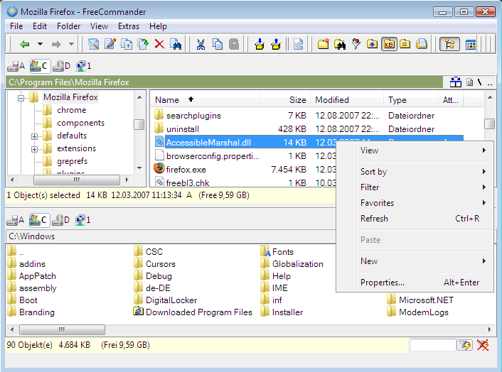
How about show status info conveniently under both panes [pic below]?
Also check out this screenshot example from another file manger. Notice how it simplifies the interface by consolidating the info into 1 type of status bar instead of 2 types.
Last edited by TsunamiZ on 2009 Oct 29, 03:57, edited 2 times in total.
seconded. being used to krusader, i still have yet to train myself to look under the left pane for this info, when the pane i'm normally using is the right one.
I always use top/bottom; but it seems to me essentially we have two status bars already so
Could folder and drive information be an option for the existing info bar (perhaps a default for active pane) This would be useful for me sometimes, and would save screen real estate;
For that, you have to do three things:
(a) Check the size of your selection (status bar)
(b) Check the free space in the target disk (which may not be displayed in the opposite pane at the moment)
(c) Compare them to check if the selection can fit
But the Robust Transfer has a built-in option to check the free space required to copy/move any selection. You don't even have to look anywhere!
TsunamiZ wrote:...but there isn't options for the multiple items and free space...
I would also like more functionality in the info bars.
While I like the idea of the 'info bar' so that non-Detail-view panes can display the info from a custom set of columns, the fields for display on the Status bar should also be available in the info bars, i.e. per-pane Status Bar.
btw: this may not seem like a big deal. but for maximized x2 window and a modern 24" 1920x1200 screen size, it causes the eyes to move too much. having the info under both panes is more ergonomic and intuitive.
What about laptops with 14" screens or even netbooks with even smaller screens. Screen space is limited, so I for one would not like to see both panes have this status bar
I am not convinced about the suggested enhancement for status bar as shown at the top. This are my reasons:
1. To much information cane lead to the opposite of the wanted result: The user simply ignores it, because it takes too much time to view at every given info.
2. In case of horizontal arrangements of the panes it would be probably more confusing then helpful.
3. For local drives I do not see the real advantage. A partition with less than 15% free space is likely to be not healthy. And in this case special observation is needed. And with the size of today's drives copying or moving the amount of 15% of those values is surely not the all day job. If in a given situation this should be the case the copy / move process takes such an amount of time, that twice pressing TAB to see the free space of the drive in the opposite pane does not seem to be the big deal.
4. Only in case of USB-drives and similar this seems to be an real advantage. But also only for those, who actually show this drive (as target) in the opposite pane. Especially with those drives it is easily possible to copy files via the sendto-menu, and in this case the enhanced status pane wouldn't be of any help. The same is true with the robust copy / move dialog choosing the USB-drive with the second option ("Here"). - BTW: If you open the the USB-drive in the other pane you have to make this pane the active one at first and then select the target (USB) drive. In this moment you automatically see how much place is left there. It should not be such a great thing to keep this value in the brain.