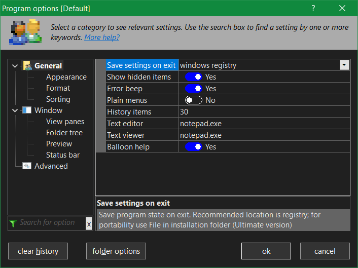
* REDESIGNED PROGRAM OPTIONS. All program settings (TOOLS > OPTIONS menu) are using the new property control. Momentarily old hands will be confused, but the new options system is better organized and you should be able to find options quickly. They are organized in broad categories like General, Appearance etc, selectable though a tree control. As you select a category, you see the relevant options to the right. Each option has its explanation.
The property control has 2 columns, on the left is the property name, and on the right the property value, which you can change. Most options are on/off checkboxes you can toggle with the mouse or space key. Other options are numbers which you type in, and there are special font and color selectors. Use the [...] button to the right to operate these (or F2 key).
Use up/down arrow keys to navigate option lines. If the selected option doesn't accept keyboard input, you can start typing an option name to quickly jump to it, like you find filenames in folder panes (incremental search). If you type more than 4 letters in quick succession, the focus jumps to the FILTER box, where you search for properties by keyword.
The search box is very useful to find an option, wherever it may be in the tree. As you type more keywords, you find less options with increased precision. Note that ALL keywords you type are searched for, but if nothing matches, the search automatically switches to ANY keyword mode, where a single keyword match is enough. Text in property description and values is also searchable.
You can change properties in the search results list directly. To see all properties, clear the filter text with [X] button.
Using the keyboard, press SHIFT+TAB to jump into the category tree, then TAB to go back into the property list.
* Advanced option MGAO3_NOSAVEGLOBAL will not even save global options (bookmarks and such) if "save settings on exit" is disabled from program options. Otherwise changes to global options are always saved.
I don't understand why good old checkboxes were deemed evil by someone along the line and seen as in desperate need of replacement with some other kind of widget. At least here, the "enabled" state is clearly marked with a noticeable color change--an improvement over many implementations of these slider selector widgets. But still--what's wrong with checkboxes?
Just installed xplorer2 v.5.50.11 beta
All things are much clearer, better laid out.
My old settings were preserved without a hitch.
Congratulations, Nikos!
A few feature requests:
If at all possible, I’d like to have a crumbs bar for each pane in dual pane mode.
On my system, the drivebar space indicators are hardly visible and don’t actually give proper indication.
Refresh is still not always happening automatically. Could this be improved?
Robert2 wrote:
I’d like to have a crumbs bar for each pane in dual pane mode.
Umm... exactly how is this crumbs thing better than the headers already over the panes? If you Right-Click (not Left-Click) any part of their subpath components, they already branch out in a manner far superior to this crumbs thing, no? As far as I can tell, crumbs are just a gimmick to hide that fact that there's no scones left in the basket.
mjbrookes wrote:Ah Ha the font size is bigger ... I can actually read the text
Don't judge by the picture. The real thing is just as claustrophobic as ever.
kger wrote:But still--what's wrong with checkboxes?
My hero. Unfortunately the two of us holding candles against the onslaught of poor visual design probably won't hold back the tide.
Last edited by Kilmatead on 2024 May 07, 16:46, edited 1 time in total.
kger wrote: ↑2024 May 07, 11:23
I don't understand why good old checkboxes were deemed evil
ephemeral fashion?
Robert2 wrote: ↑2024 May 07, 13:47
On my system, the drivebar space indicators are hardly visible and don’t actually give proper indication.
Refresh is still not always happening automatically. Could this be improved?
drivebar indicators struggle with a trade-off between information and being kept small. You will see them better if you use large icons for the drivebar
as for the refresh problem, what kind of drive has problems? You can try turning on the alternative autorefresh mode from ADVANCED OPTIONS
I just realized that the crumbs bar could be turned off. Done! May it rest in peace for evermore.
I’ll just ignore the drivebar indicators. I like small minimalistic icons.
If I go to https://assets.amuniversal.com/9a3364d0e470013c4d78005056a9545d, right-click and save the picture to my downloads folder, I get the following entries:
C:\Users\Admin\Downloads\0bcd382a-a766-4c4d-9c2a-887e0bb8afa8.tmp
pe240507.gif
But the tmp file doesn’t actually exist. I need to use F5 to make it vanish from the display.
Robert2 wrote: ↑2024 May 07, 13:47
On my system, the drivebar space indicators are hardly visible and don’t actually give proper indication.
Would it be possible to add the free space information to the tooltip for a particular drive, preferably as a second line below the drive letter and name? Something even as simple as "95% full" would be useful.