At the risk of stating the obvious, I realise the "default" layout includes the drive bar needlessly extending the length of the screen, but there's nothing preventing you from dragging and dropping another toolbar adjacent to the drive bar, which then allows you to resize them both to taste.
If you only use 2 or 3 drives, shrink it down to that size, and the rest of the line will be filled by the toolbar, for as many custom buttons (or bookmarks in your case) as you wish.
 @Nikos
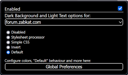
: If a toolbar has more contents than can be displayed, there's a small button that displays a dropdown menu for the other items. I just noticed that in "dark mode" the right-arrow icons on this button are drawn essentially black-on-black, so normal mortals can't see the button unless they accidentally mouse over it.
So... is this an oversight, a cruel joke you play on people with worse eyesight than your own, or (more likely) some kind of Toolbar32 owner-draw issue that you're just too lazy to solve properly?
(Why yes, thank you for noticing, I
do enjoy asking backhanded questions! You know me so well, innocent lad that I am.

)